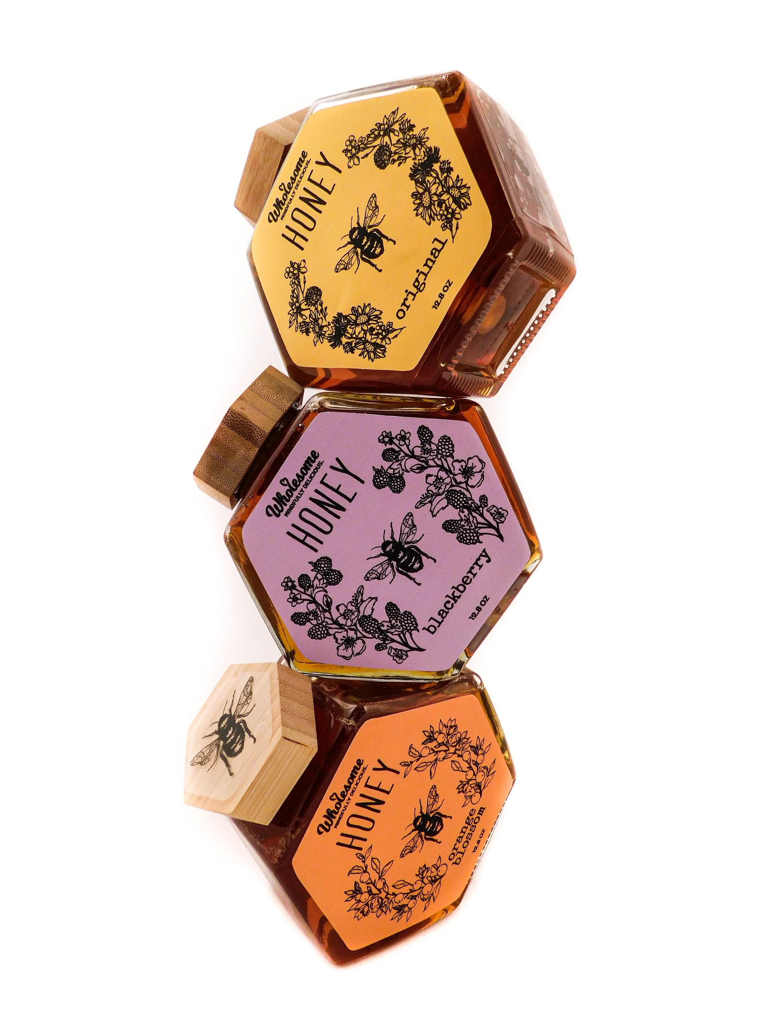
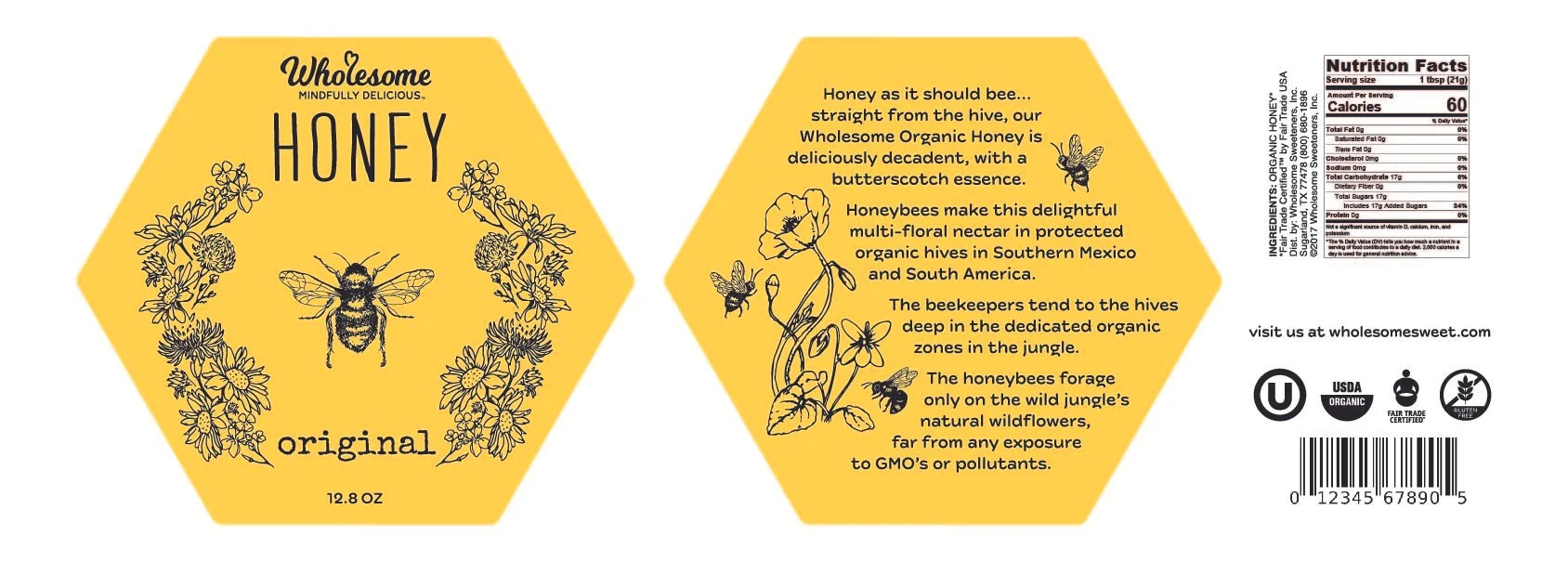
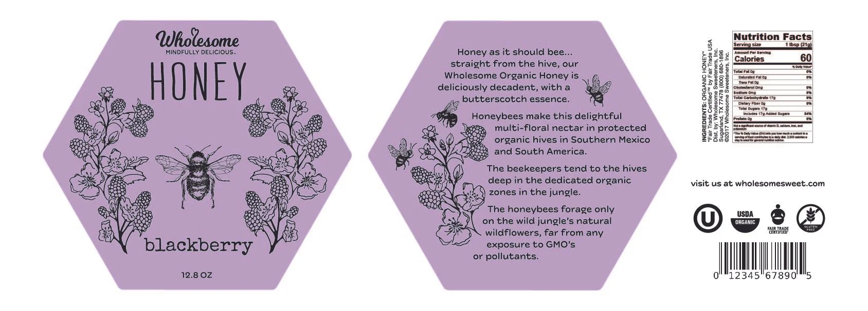
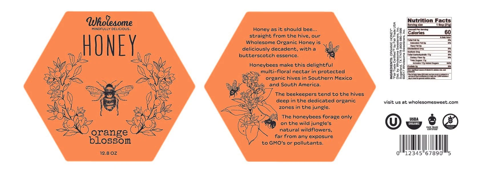
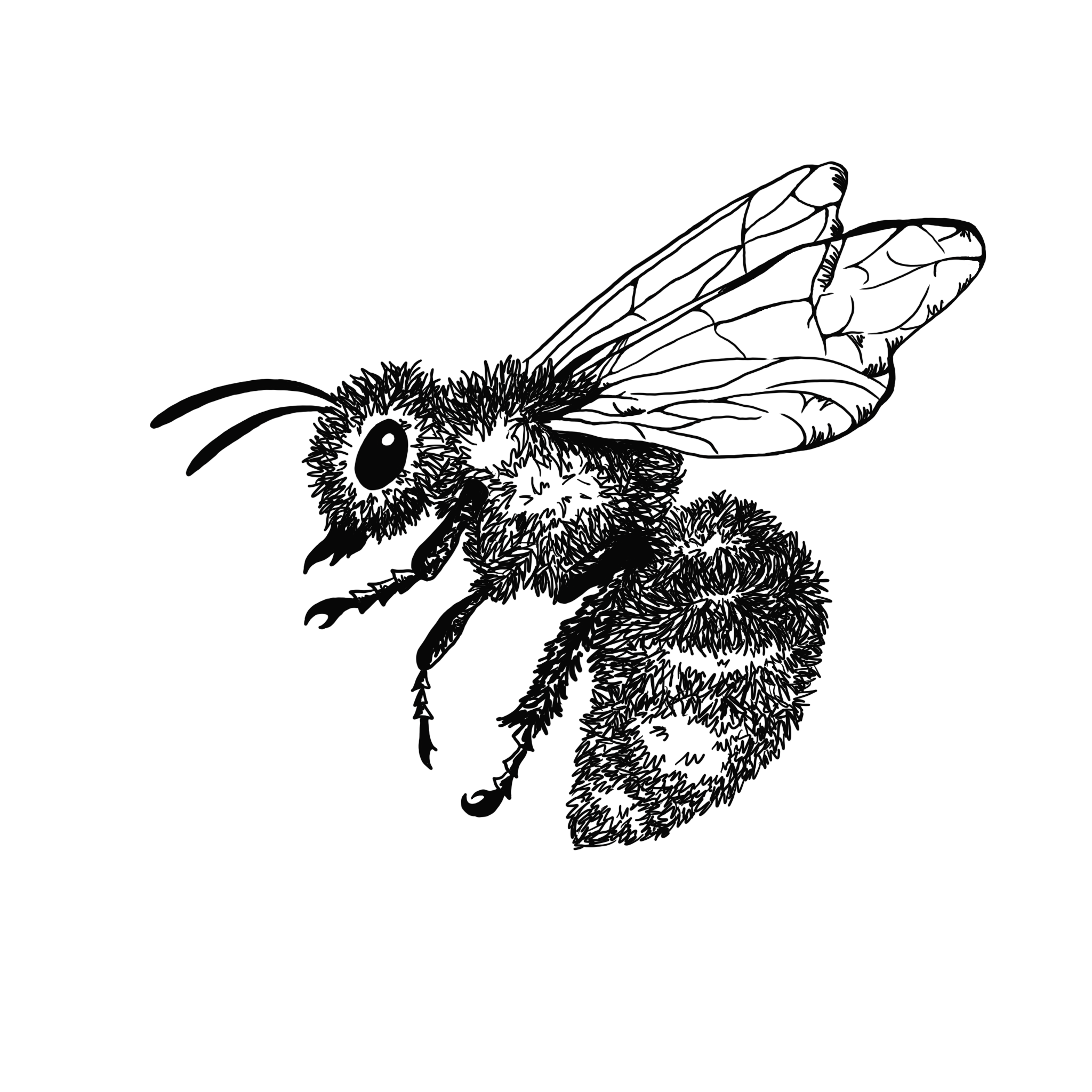
Since 2001, Wholesome has been committed to making products with real and recognizable ingredients straight from the bees. As a company, they work hand in hand with the beekeepers to ensure their products are the best tasting and most pure. Bringing honey jars back in style, this brand refresh focuses on grabbing the attention of all honey-lovers. Incorporated are similar aspects from the original logo, such as the heart and scripted typography, to give a sense of familiarity. I wanted to find a font which portrays the organic feel Wholesome offers, and was attracted to the swooping "W”. As for the tagline, I wanted to find a sans serif font to compliment the fun typography used for the logo. Farm New was the perfect match, with curved edges it represented the look I was going for. In contrast to the original logo, I wanted to tone down the colors, allowing for fun and bright labels. Wholesome's idea of real and pure ingredients led me to illustrate each flavor in its most simple form circling around the most important contributor - the honeybee. Without these bees, there would be no honey!
I was inspired by the natural geometric shape honeycombs create and wanted to depict the pureness of Wholesome's honey as well as the company's transparency through the use of my glass hexagon jars. The use of the jar's wooden cap and the hand-drawn illustrations gives the packaging a sense of authenticity. This authentic feel goes hand in hand with the color choices of the typography and illustrations - I wanted the colorful packaging to catch someones eye on a shelf, but when they pick it up it feels personalized.
Rebrand

